
Visual balance in graphic design is defined by the thoughtful placement of elements in relation to each other, the palette being used, and the surrounding space with the goal to make everything work together as a seamless whole.
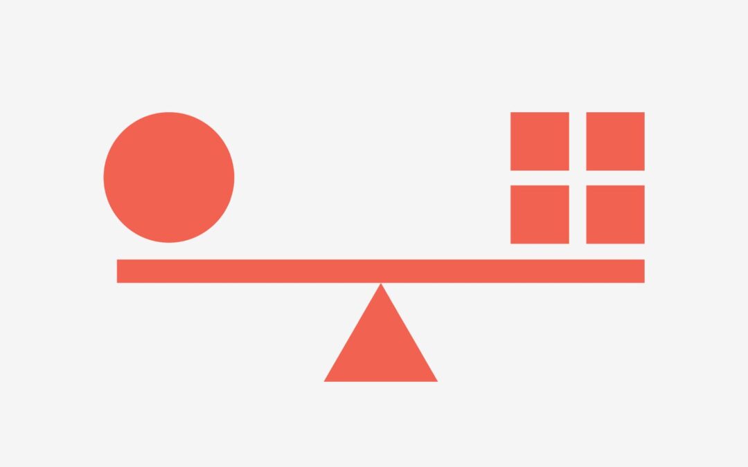
But to understand how to attain visual balance, we must first understand its importance. People are attracted to balance – balance equates safety and stability, whereas imbalance can lead to uneasiness, tension, and confusion. To illustrate, if you were to look at two buildings, one upright and the other leaning slightly, you’re more likely to go to the one standing upright as it would seem to be better built than its leaning counterpart. This logic applies to graphic design as well.
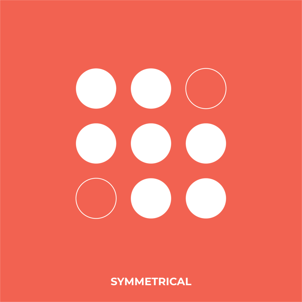
Balance can be achieved in various ways: In Symmetrical designs, if a line were to be drawn in the middle, each side would be similar to each other. Although symmetrical layouts are great for balance, they might not always be interesting to look at. Experimenting with this layout by using engaging elements and techniques can keep this layout from coming across as boring.
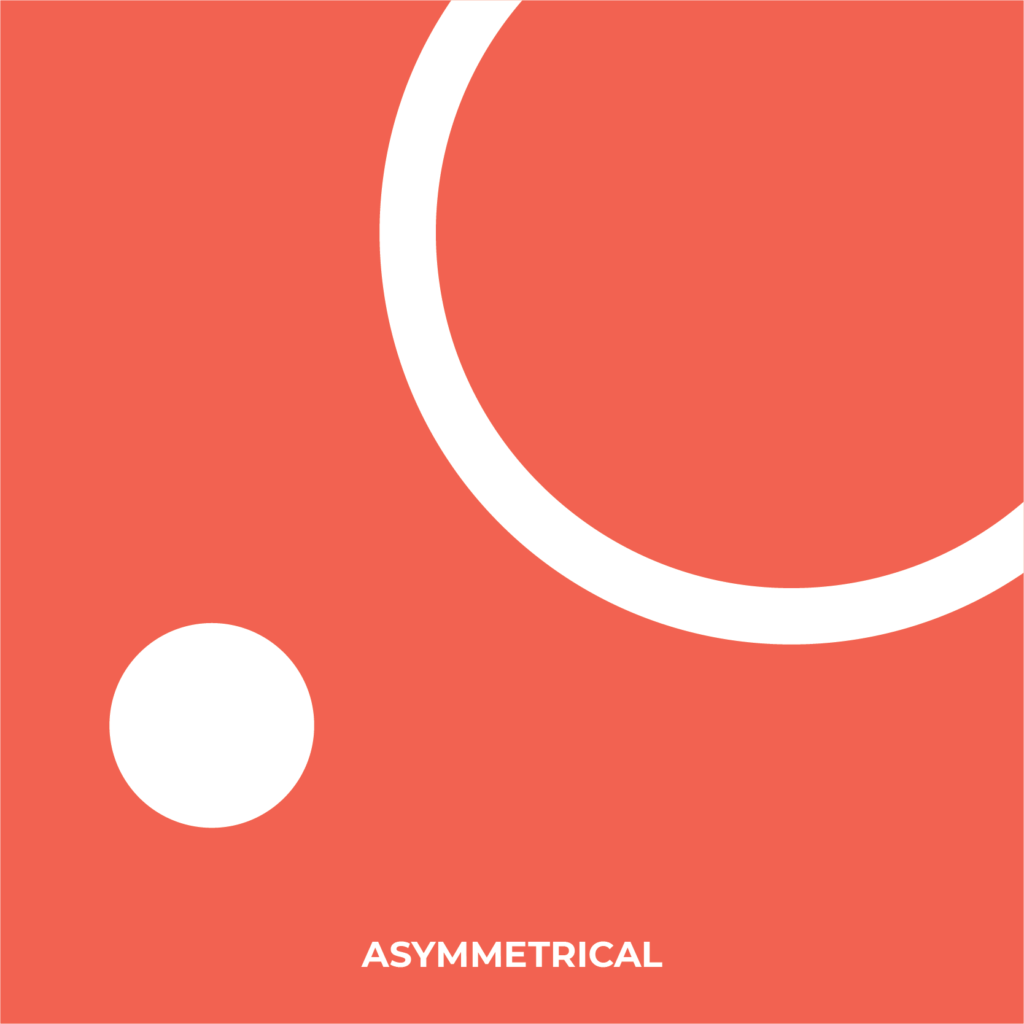
Contrary to its name, Asymmetry can be used to attain good balance. This can be used as an interesting layout and can give your design mobility. In asymmetry, both sides are different. An example would be several small elements on one side balancing out fewer or a singular large element on the other.
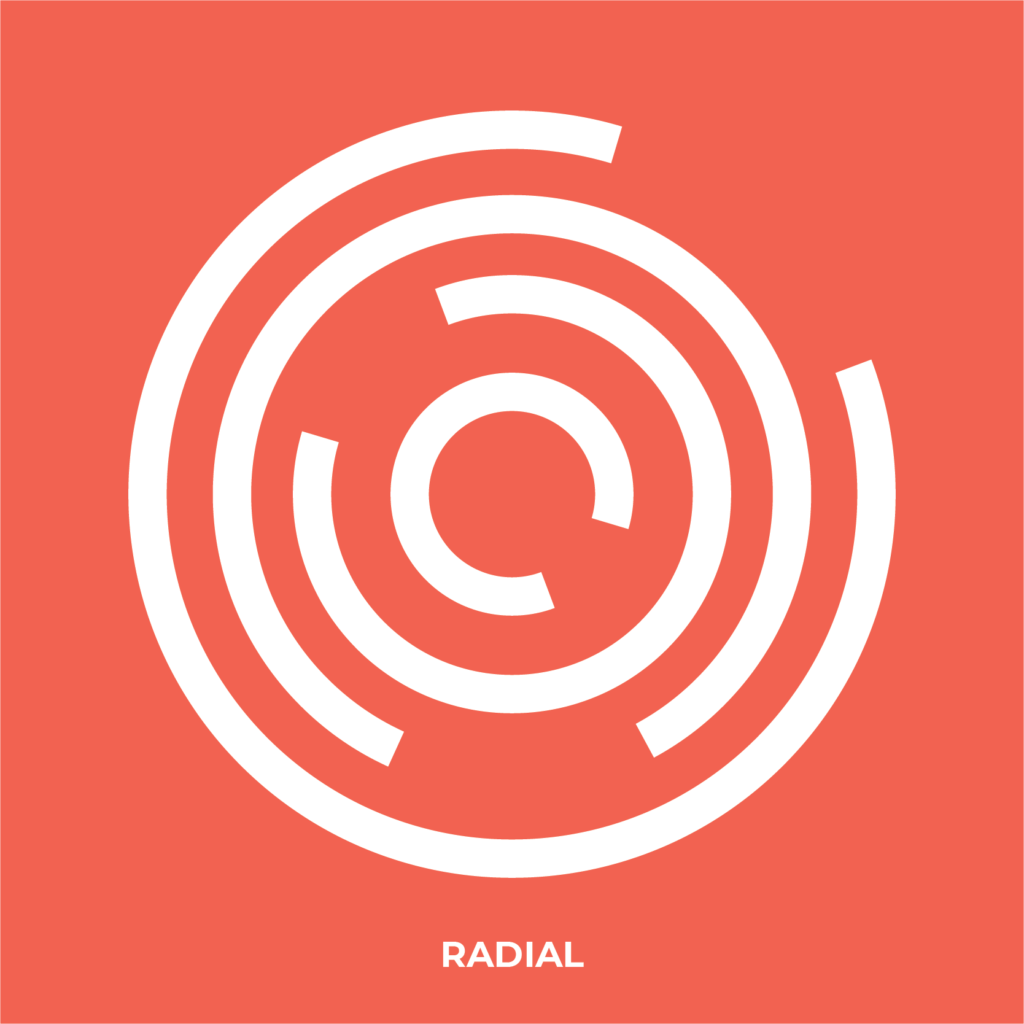
In Radial balance, objects are balanced in accordance to a singular point, like a snowflake. The objects “radiate” from that central point and can be placed in different distances from each other.
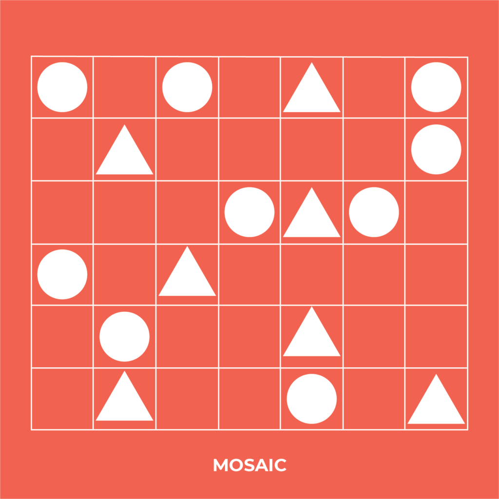
A less commonly mentioned balance is Mosaic balance. Similar to symmetrical balance, objects are placed in a grid-like template, but Mosaic balance encourages the eyes to look over the entire field, rather than staying on only the focal point. This is best described as an “organised mess”.
There are other ways to achieve balance in graphic design. Being mindful of these details can make or break your design!
Smaller areas with vibrant or “highlight” colours go well with larger areas with neutral or “background” colours. Various shapes and their placements can make for a well-balanced field. Patterns or several repeated objects are orderly and satisfying to the eye. Movement can also be used to make for a more engaging design. Empty spaces can be filled in with small moving objects to keep your layout more engaging or to bring more attention to your point of focus.
Now that we’ve gone over the basics, it’s important to remember that rules are also meant to be broken. Know when to use or break the balance in your designs to keep things interesting and don’t be afraid to experiment with different placements and techniques so you can achieve a composition that’s visually appealing and just feels right.
Through the clever use of balance and design, behaviour can be affected. A viewer can be steered in a particular direction, towards a pre-agreed goal. This is vital in creating effective marketing and is the difference between art and graphic design.
Curious about Outsourced Marketing?
Understand how outsourcing your business marketing works in the time it takes to drink a coffee. We’ll be as transparent with you as possible. We’ll offer advice, share some of our work and answer questions you might be too afraid to ask now.